


The Project
Mindful Market began as a pop-up in response to growing demand for clean, health-focused products following the pandemic.
Its success led to the launch of a permanent space combining a gourmet market, café and clean beauty offering, alongside educational content and workshops supporting healthier lifestyles.
The Identity
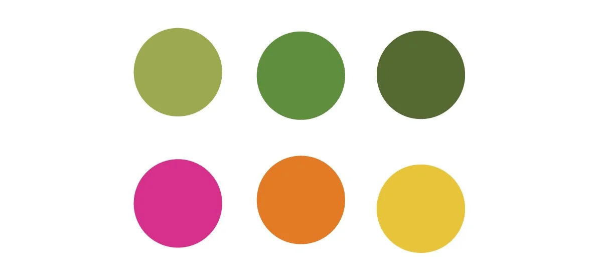
The visual identity centres around a clean, whimsical word mark paired with a simple leaf motif, giving the identity a natural, approachable character while keeping the overall mark clean and distinctive. The original palette featured bright colours which were to portray freshness and vibrancy. However recently the tone has moved towards more neutral and calming colours.
Brand Communication
The identity was extended into promotional and customer-facing materials, including magazine advertising and gift cards.
For the magazine advertisement, the product selection became the focus. A carefully arranged collection of products was paired with the brand’s distinctive typography and botantical elements to create a visual that felt editorial while remaining accessible.
The gift cards extended the same visual language into a more colourful application, using botanical illustrations and the brand palette to create something that felt both useful and recognisably Mindful Market.


Magazine Ad

Gift Cards